An opportunity to build a patient-centred experience that augments physician care.
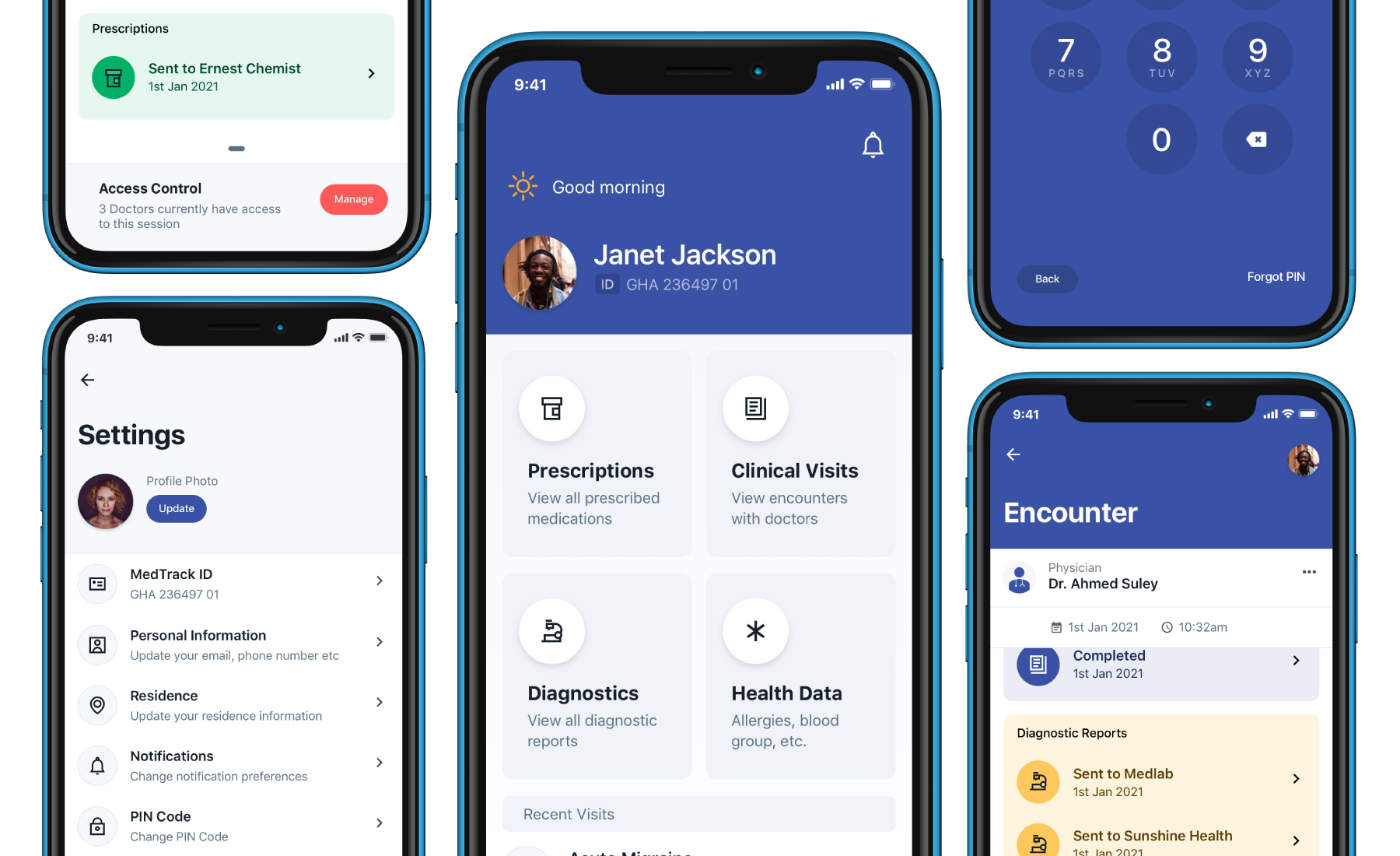
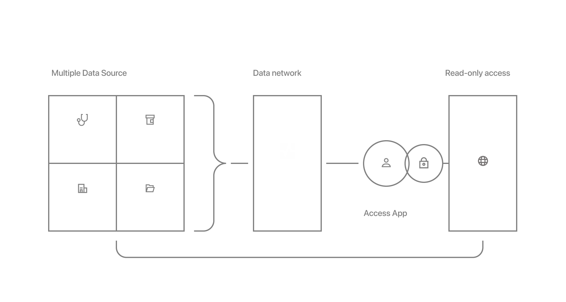
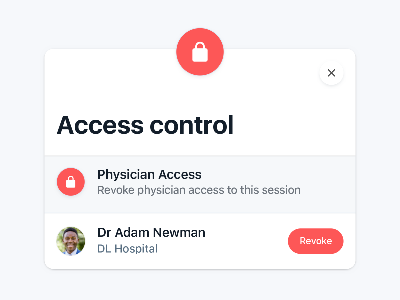
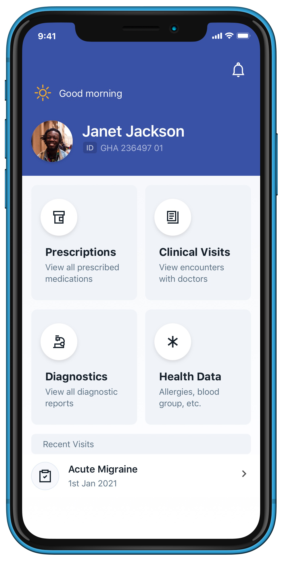
The goal here is to empower patients track their health information and access critical data without the current bureaucratic barriers
In drafting a plan to build a decentralized health information system that travels with the user, I had to spend time discussing the possibilities and barriers with service providers such as community doctors, lab technicians, pharmacists and most importantly, patients on defining the major needs, complimentary use cases and nice-to-have.
In Africa, caregiving is hindered by communication blocks between patients and physicians. Siloed patient medical information and the general lack of patient involvement through out the caregiving experience is also a major contributor to this problem.
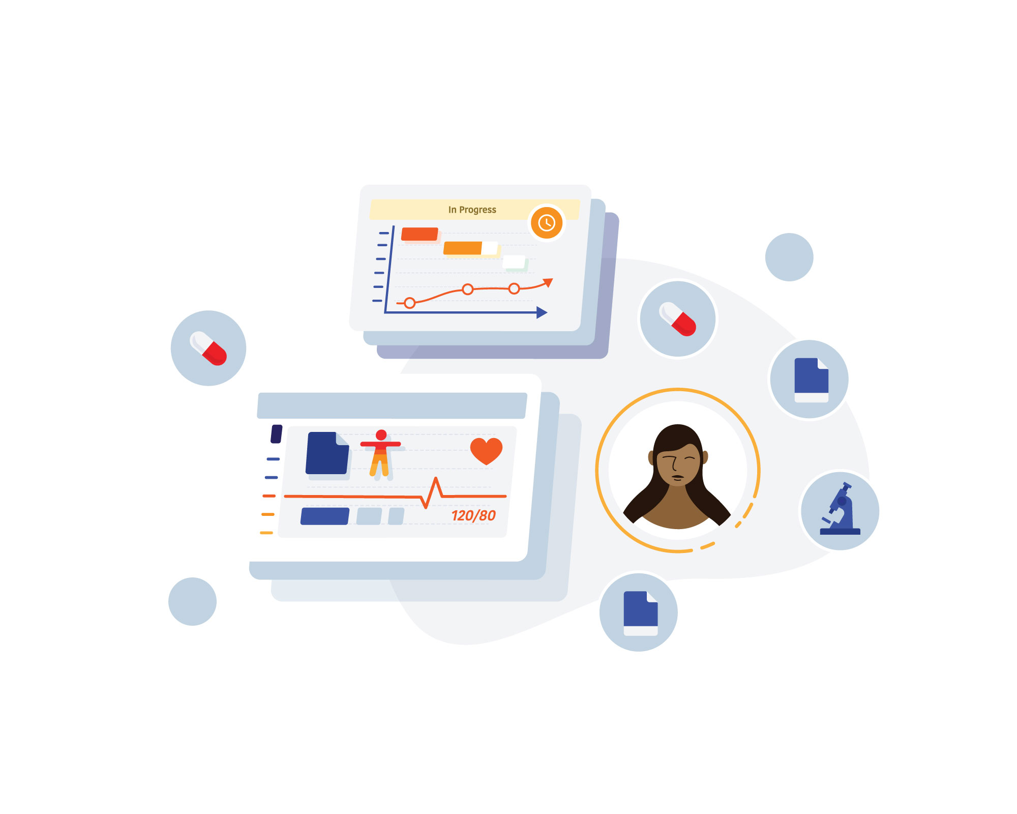
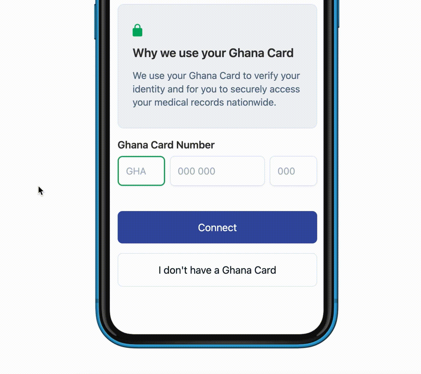
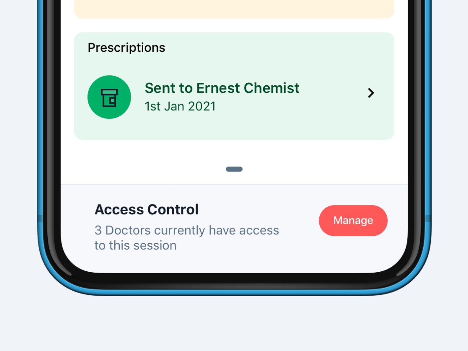
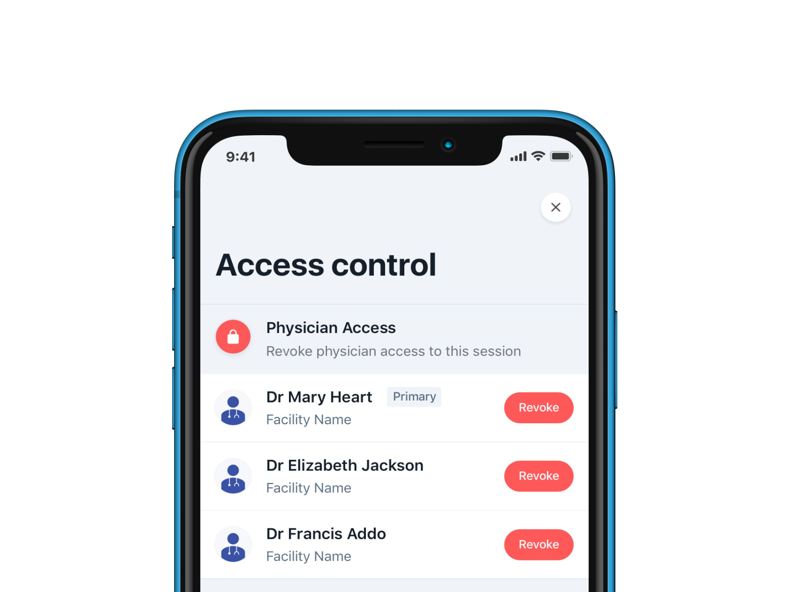
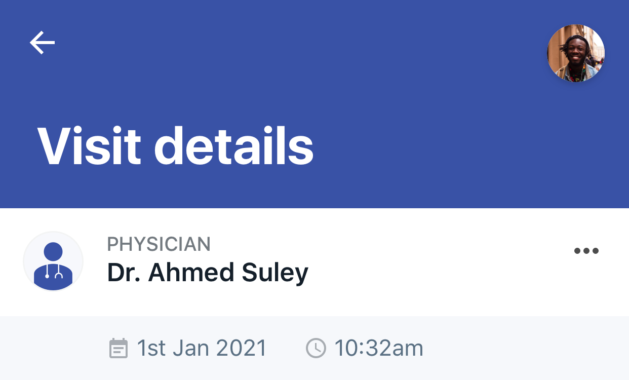
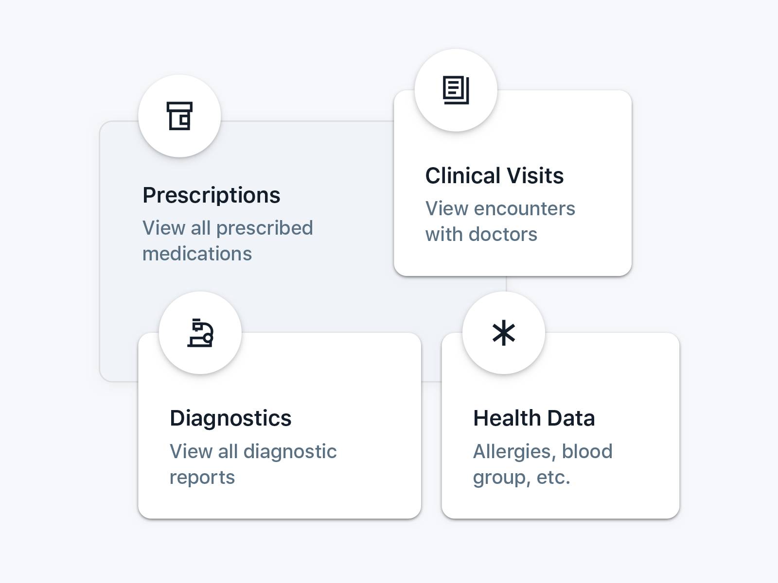
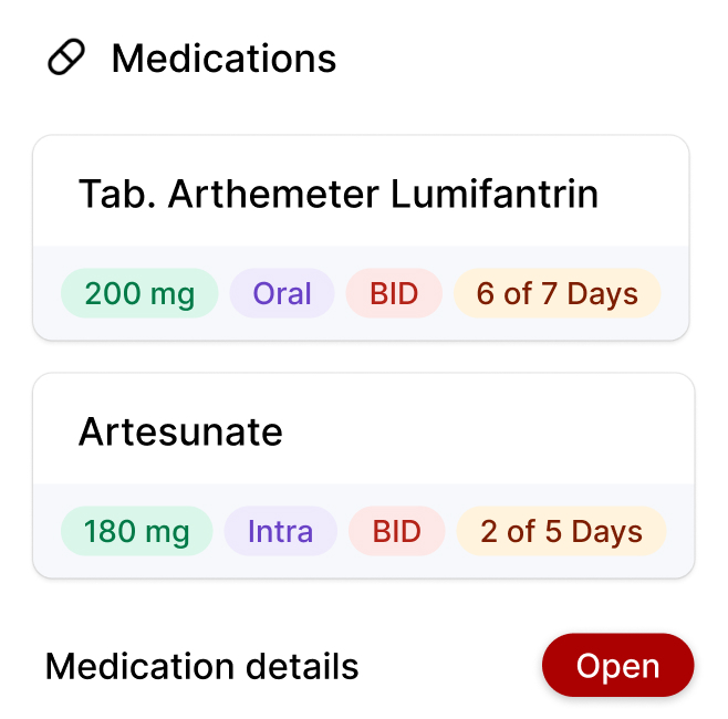
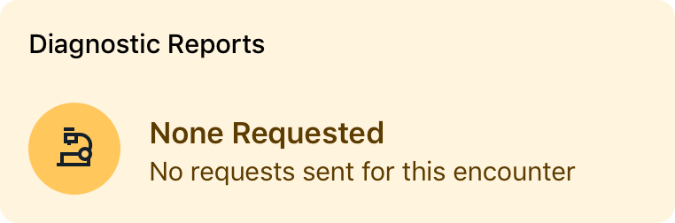
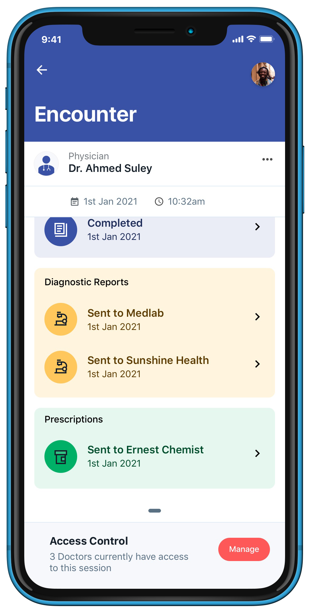
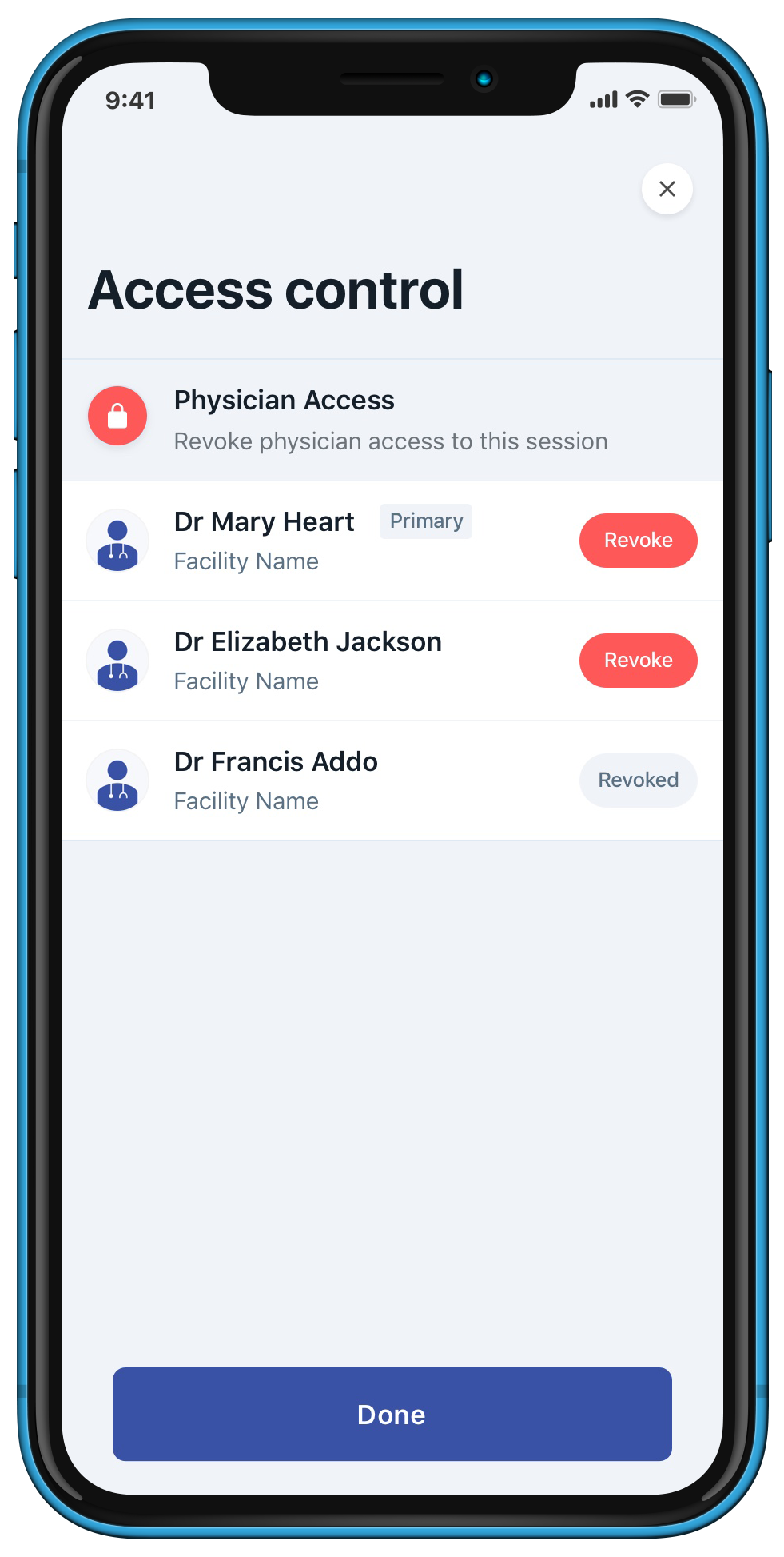
MedTrack allows facilities to capture a comprehensive picture of patient health information, medical history and other clinical data. Here, I set out to design a solution that empowers patients to take control and have oversight over the captured data.